case study 01 / 03
.filo
A messaging app for adults over 75.
Designed from qualitative usability research with real users aged 78–88, to make everyday digital communication accessible without isolating older adults from their family’s network.
- Role
- Sole designer: research, UX, UI, visual identity
- Context
- MSc thesis, ISIA Firenze
- Timeline
- Oct 2025 – Feb 2026 (4.5 months)
- Methods
- Usability testing, interviews, empathy maps, affinity diagram, pilot test
- Tools
- Figma
- Outcome
- In the pilot test, a 75+ user with low digital literacy completed 4/4 everyday tasks without help. Caregiver feedback led to 3 fixes on the assistant side.
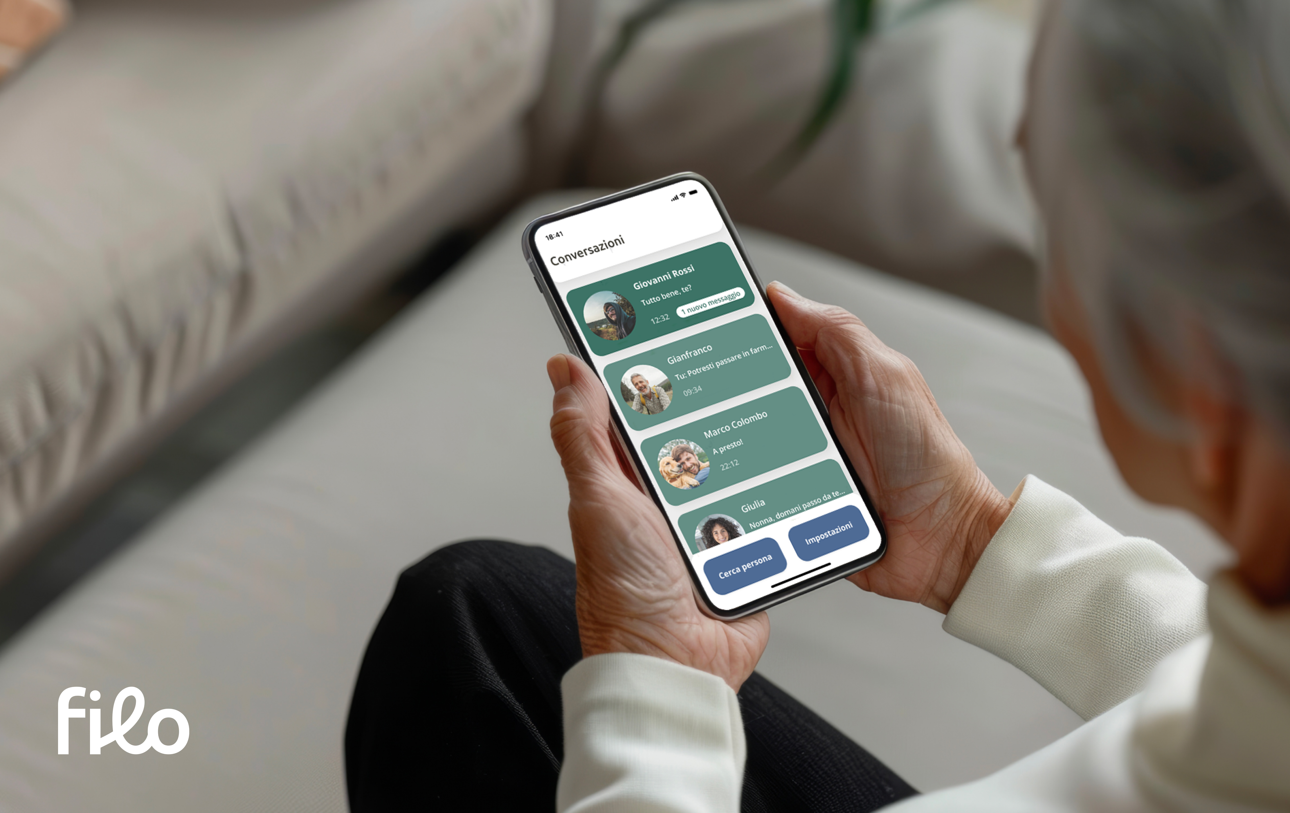
The problem
one in four
We live longer, but digital products rarely consider older adults. When they do, they are simplified rather than inclusive, and end up isolating people even more. This is the grey digital divide: missing digital skills that lead to isolation and dependence.
How might we rethink the digital experience of older adults in a more dignified and inclusive way?
I focused on messaging: communication keeps relationships and autonomy alive, and it is an everyday experience, not a medical one.
My approach
Design for extremes.
If you design for the people with the most complex needs, you create solutions that are simpler and more flexible for everyone. This is known as the electronic curb-cut effect.
Research
Qualitative usability tests of WhatsApp, the app families install for their older relatives.
- Participants
- 3 women, aged 78–88
- Profile
- Smartphone users, low to medium digital literacy
- Session
- Welcome → interview → home screen tour → 4 tasks
- Tasks
- Everyday ones, e.g. send a message, find a contact
An intentionally small sample: the goal was to understand behaviours and emotions, not to measure them.
03.1What they told me
I’m afraid of making a mistake and not being able to go back.
Participant 2 I don’t use the bar at the bottom: I’m afraid to touch it and mess something up.
Participant 2, on WhatsApp When there are English words, I don’t understand what to do.
Participant 3 I can’t tell who it is when there’s no contact photo.
Participant 1
03.2From observations to decisions
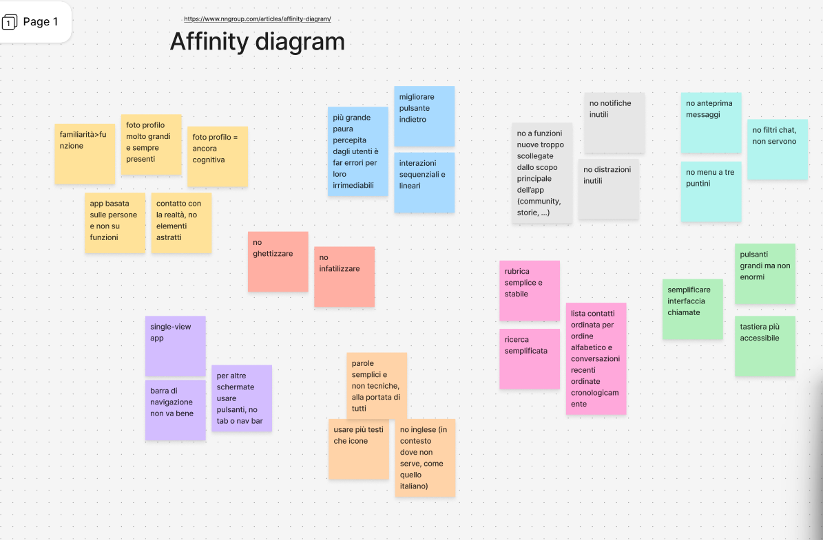
I synthesised each session in an empathy map, then clustered all observations in an affinity diagram.
| What I observed | What I decided |
|---|---|
| The interface feels visually crowded: the main task, talking to people, gets lost | → A home built around people, with very few actions |
| Strong fear of making mistakes, unclear way back | → Linear paths, explicit confirmations, an always-visible “Go back” |
| People orient themselves through photos, names and real-world icons (the phone handset) | → Large photos, names always visible, the whole contact card is tappable |
| English words and jargon (“updates”, “communities”) block understanding | → Plain, familiar Italian; words instead of icons |
| Scrolling is the gesture that feels safest | → Vertical lists, a single view, no tab bar or hidden gestures |
03.3What existing solutions miss
Apple Assistive Access, BIG Launcher and Oscar Family simplify by removing. Useful features such as voice messages disappear, and older adults end up treated almost like children, as if they needed less communication rather than more accessible communication.
The solution
Simplify the interface, not the person’s possibilities.
Filo is designed for Italian users, so the screens are in Italian. Key labels are translated in the captions.
-
People, not features
The home is a list of people: large photos, visible names, and the whole card is one big tap target.
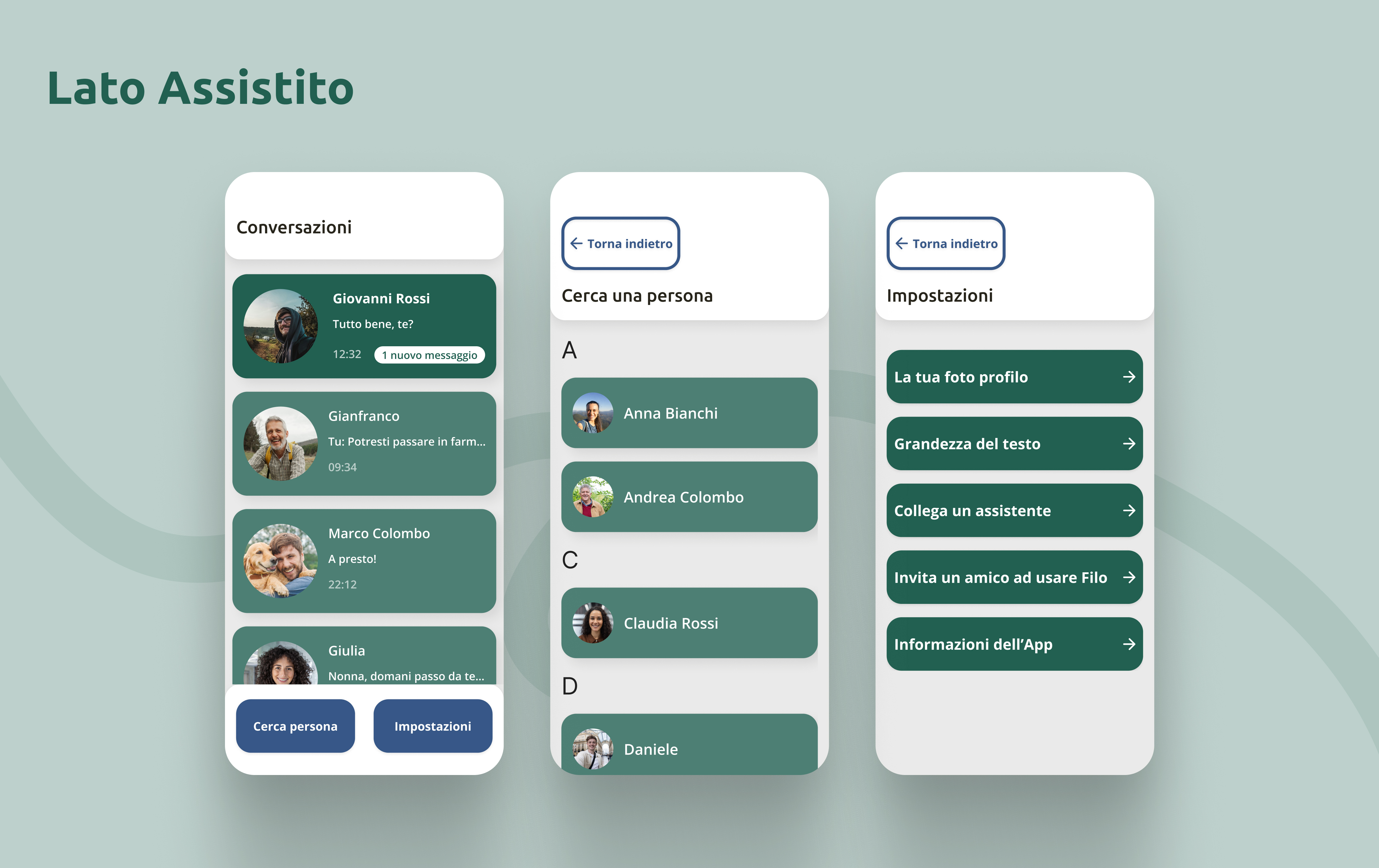
Assisted side: “Conversazioni” (conversations), “Cerca una persona” (find a person), “Impostazioni” (settings). -
Words instead of icons
Almost every icon is replaced by a clear, explicit label, so each button says what it will do. Nothing is taken away: voice messages, photos and calls are all there.
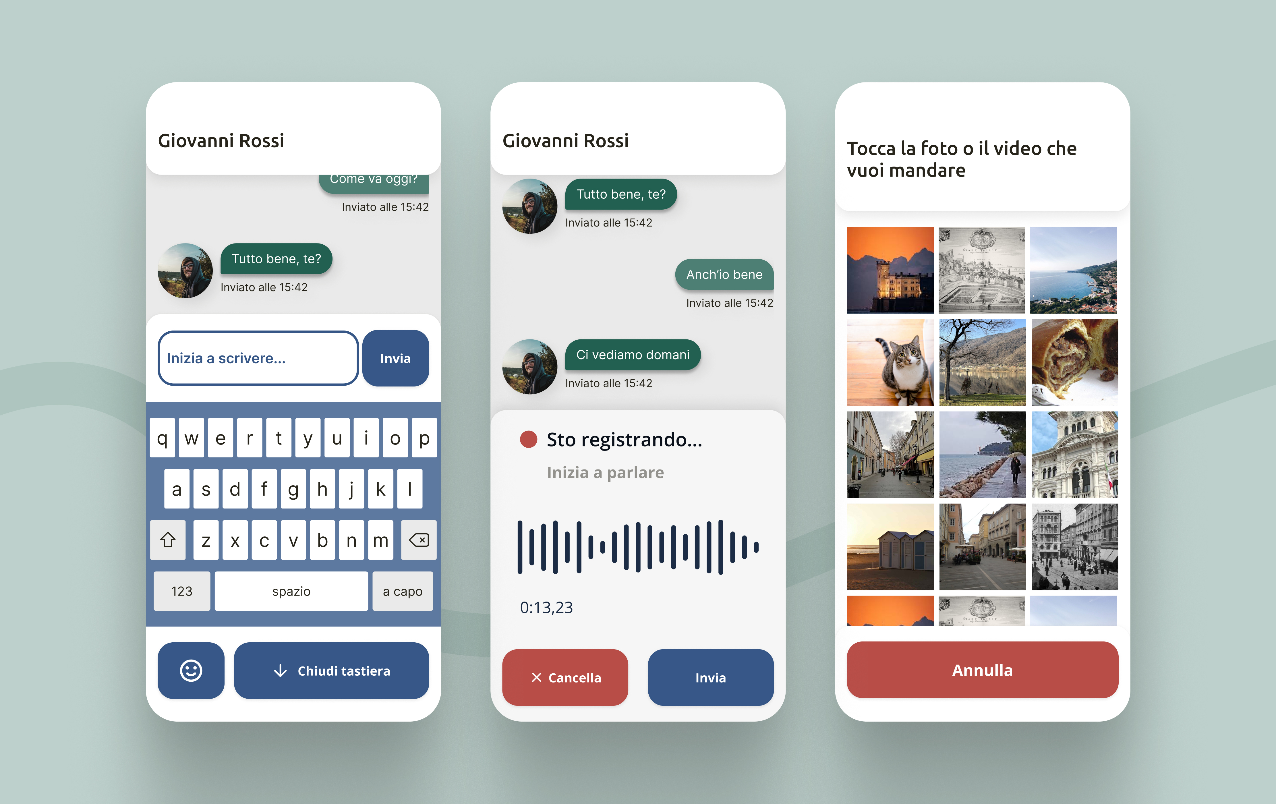
Replying in a chat: “Inizia a scrivere” (start typing), “Sto registrando” (recording), “Tocca la foto” (tap the photo). -
Two levels of interaction
Colour tells you what kind of action you are about to take.
Blue: actions that change somethingGreen: reading and light interactions -
One app, two roles
The assisted person and their caregiver share the same interface and the same paths: no separate “senior app”. The role is chosen during onboarding; the caregiver gets a few extra options, such as turning off features or managing contacts, remotely and with consent.
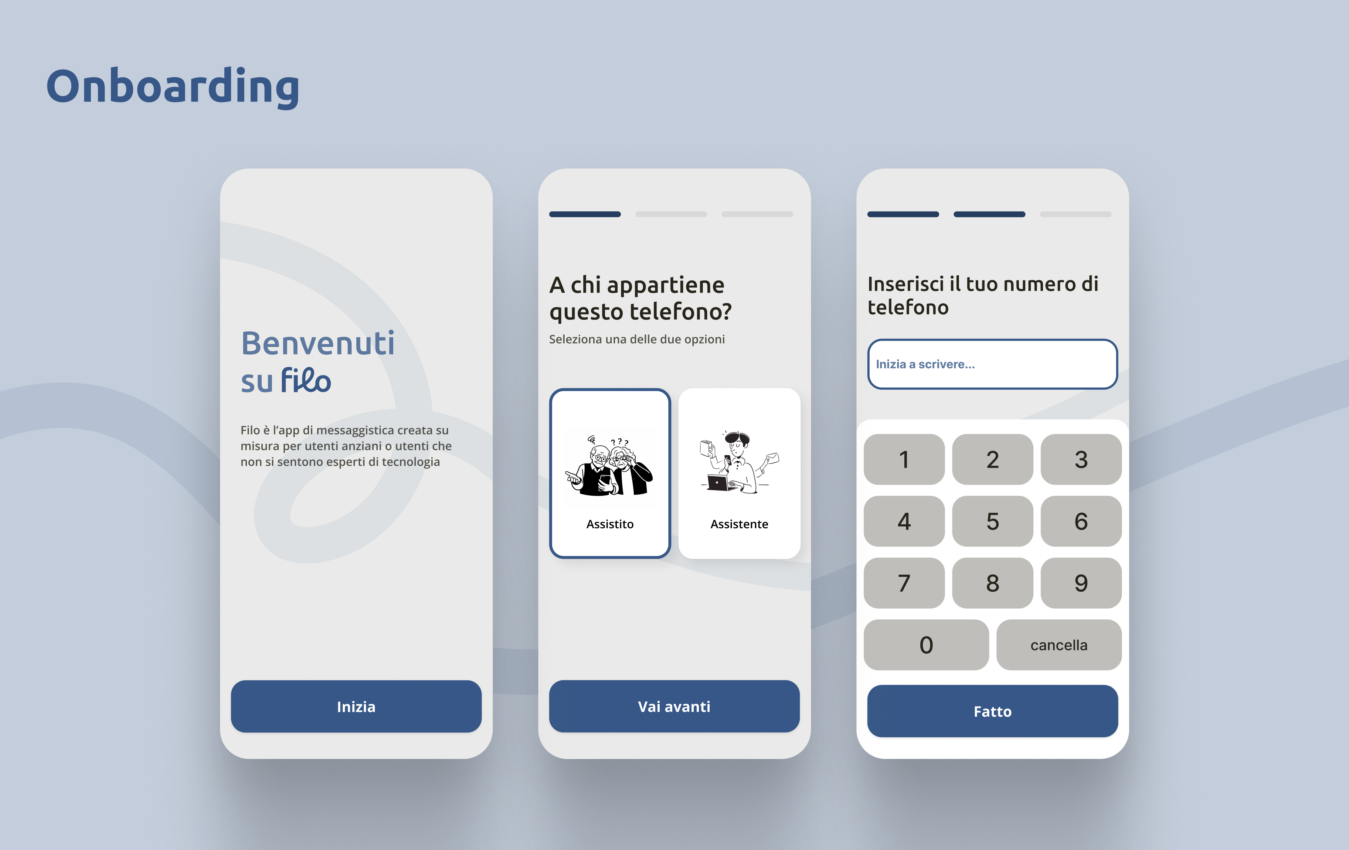
Onboarding: “A chi appartiene questo telefono?” (who does this phone belong to?). 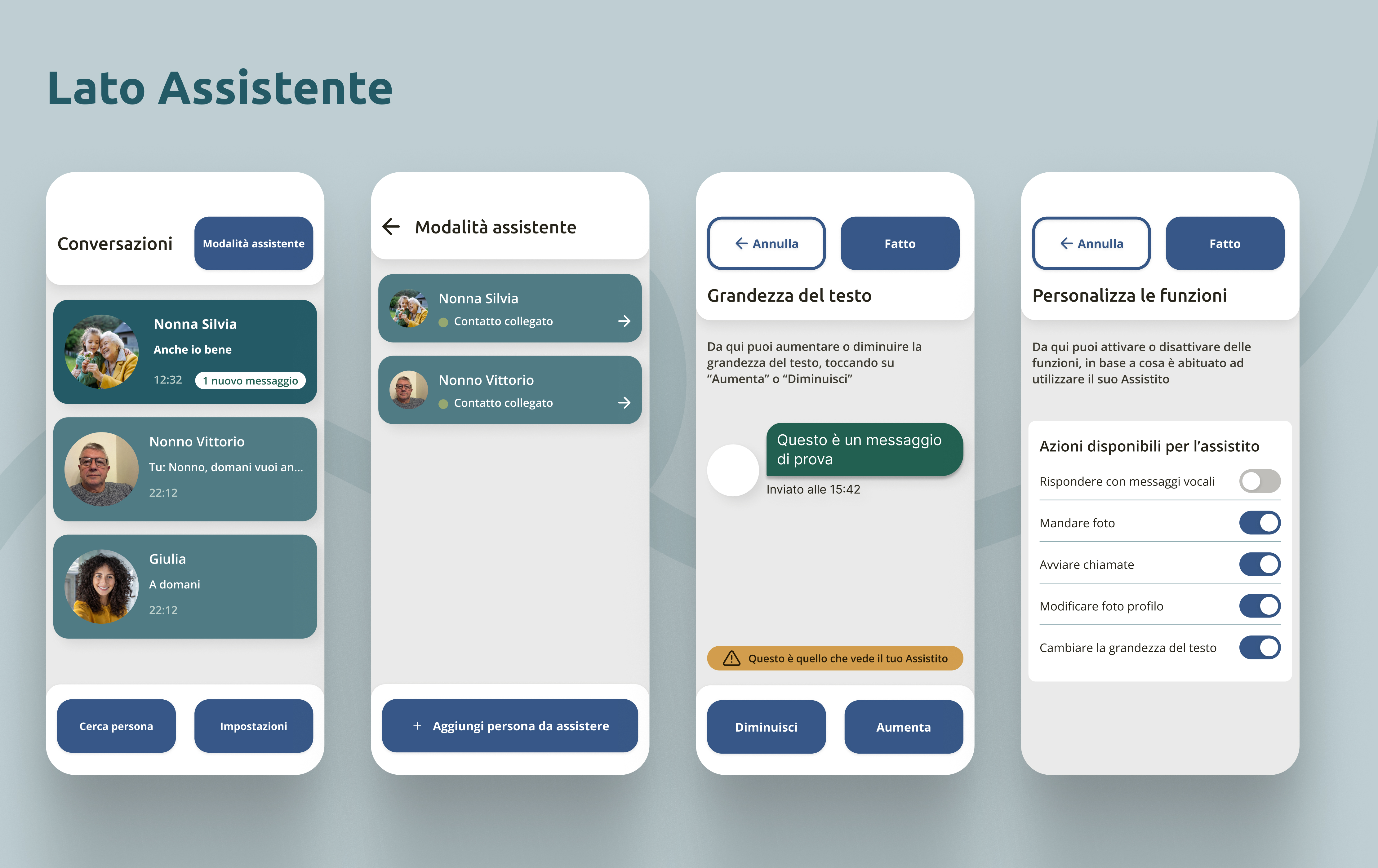
Assistant side: “Modalità assistente” (assistant mode). -
Built for interoperability
Everyone stays on WhatsApp because their contacts are there. The EU Digital Markets Act requires messaging apps to talk to each other, so Filo can offer a better experience without separating people from their social network.
Validation
05.1Pilot test, assisted side
One participant over 65 with low digital literacy, chosen on purpose as an extreme case. Four everyday tasks: send a message, find a contact, start a call or video call, send a photo.
without asking for help
She always knew what to do, found the actions predictable and showed less anxiety than when using WhatsApp.
I’d like to have this app: I immediately understand how to do things and what happens.
A pilot, not a statistical validation: it confirms the design direction, which now needs testing with more users.
05.2Iteration, caregiver side
I showed the assistant side to people in the caregiver role and collected qualitative feedback. Nothing blocked them, but three issues reduced their sense of control.
| Issue | Before | After |
|---|---|---|
| “Whose app am I changing?” | The screen was titled “Nonna Ada”: it looked like one’s own profile | → “Modifiche per Nonna Ada” (changes for Grandma Ada): the context is explicit |
| Weak visual hierarchy | Settings split across loosely related sections | → One clear list of actions: “Cosa puoi fare” (what you can do) |
| Unclear toggles | Switches in the list took effect immediately, with no visible consequence | → A dedicated screen with an explanation and a Cancel / Done confirmation; Done activates only after a change |
Learnings & next steps
Accessibility isn’t about removing things: it’s about making every action predictable and reversible.
- Test with 5–8 users and compare task time and errors with WhatsApp.
- Run a structured usability test on the caregiver side.
- Keep iterating on the confirmations and on the way back from every screen.